Lost in Space?

1. This is where you put your content. You can remove the flex positioning (change to block) and have the paragraphs run right across the page if you like. You can even remove the paragraphs (but not the containing .content.wrap) and add images, sliders or any content you prefer.
2. Lorem ipsum dolor sit amet, consectetur adipiscing elit. Integer nec odio. Praesent libero. Sed cursus ante dapibus diam. Sed nisi. Nulla quis sem at nibh elementum imperdiet. Mauris massa. Vestibulum lacinia arcu eget nulla. Class aptent taciti sociosqu ad litora torquent per conubia nostra, per inceptos himenaeos.

Hero Heading with Topnav
The Hero Heading has been created with CSS Grid, so make sure you activate grid support in 'Design for'. Also, you may have to set it to 'Display Grid' on the Styles pane.
Below the large image there is a container .content-wrap. Please use it to pop your own contents into. You can delete the current content.
The title text will move to the left side and appear vertical on wide viewports. To achieve this, the facilities in the 'Direction and writing mode' have been used, plus rotating in Effects.
Any horizontal menu can be used, either above or below the large image.Here the top menu is a Hamburger Menu, outside of the grid system. The menu can be found as a component on its own page.
The second component has the menu positioned below the image. To see a preview of it, look at the 'Hero Heading' on one of the other framework pages.
The Hero Heading will work in IE11, but you lose some of the effects, like the white outlining of the title text and the shifting of the title to the left side.
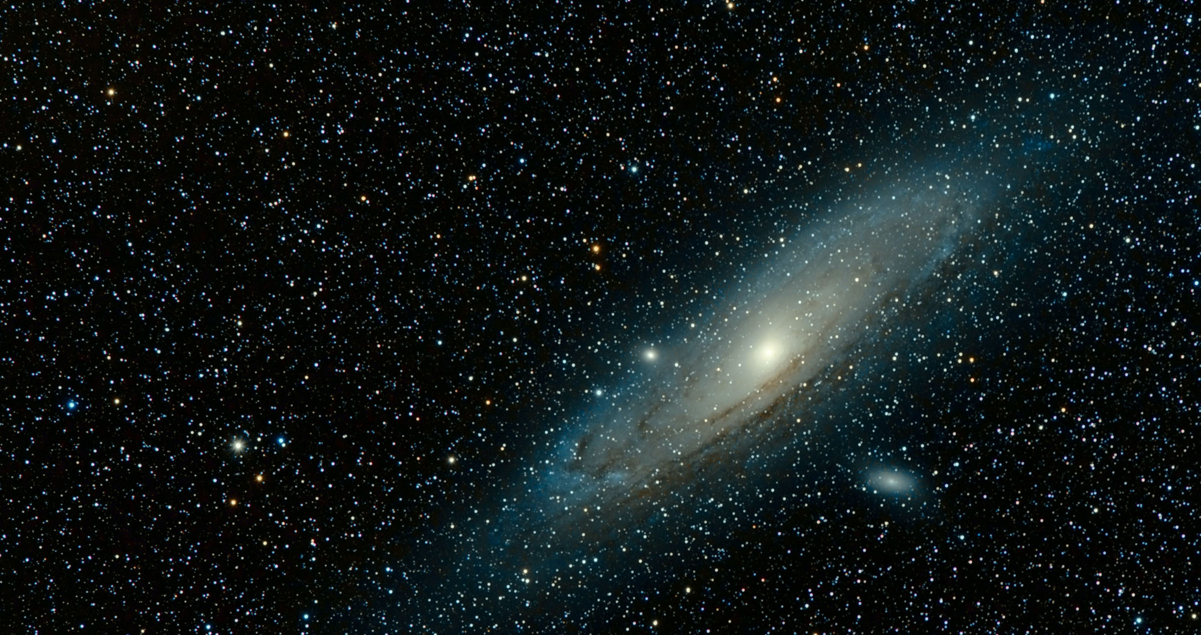
The image used in this component comes from Pixabay.
Download this component (displayed)
Download the component with
the menu below the image