The name 'Details and Summary' Is derived from the way the component has been built. These two classes working in combination will hide the 'details' from view until the 'summary' has been clicked on. The details can be anything; text, images, videos, and here it has been used for a navigation menu. To make it work, the two input boxes for 'before' and 'after' code on the Element pane have been used to place some HTML tags that otherwise would have been impossible to use in Site Designer.
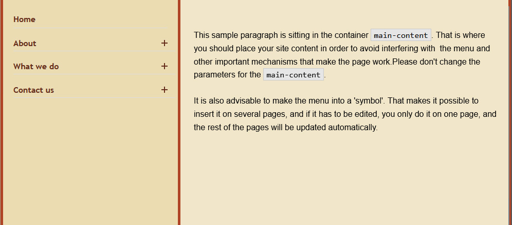
Because of some fixed positioning of some of the elements, the displayed sample had to be posted as an image.
To change the content of the details
one simply removes the check mark in the Elements Tree from 'Hide x items at this breakpoint' and edits the paragraphs on the canvas.
The nav is best suited for a one-page site with a number of 'chapters' or paragraphs. It has been prepared for three such chapters. The sub-links that open under the main links may open further pages, or go to different websites.
If more chapters are necessary, the best way is to duplicate the text with the class name menu-item-summary and the element 'UL Link-ui' and arrange them in sequence below the other similar elements.
The menu can be made to cover the whole page width by changing the width on the outer container pageinside from 1200px to 'none'.
Details and Summary Nav
The name 'Details and Summary' Is derived from the way the component has been built. These two classes working in combination will hide the 'details' from view until the 'summary' has been clicked on. The details can be anything; text, images, videos, and here it has been used for a navigation menu. To make it work, the two input boxes for 'before' and 'after' code on the Element pane have been used to place some HTML tags that otherwise would have been impossible to use in Site Designer.
Because of some fixed positioning of some of the elements, the displayed sample had to be posted as an image.
To change the content of the
detailsone simply removes the check mark in the Elements Tree from 'Hide x items at this breakpoint' and edits the paragraphs on the canvas.The nav is best suited for a one-page site with a number of 'chapters' or paragraphs. It has been prepared for three such chapters. The sub-links that open under the main links may open further pages, or go to different websites.
If more chapters are necessary, the best way is to duplicate the text with the class name
menu-item-summaryand the element 'UL Link-ui' and arrange them in sequence below the other similar elements.The menu can be made to cover the whole page width by changing the width on the outer container
pageinsidefrom 1200px to 'none'.Download this component