Here you can put your page contents
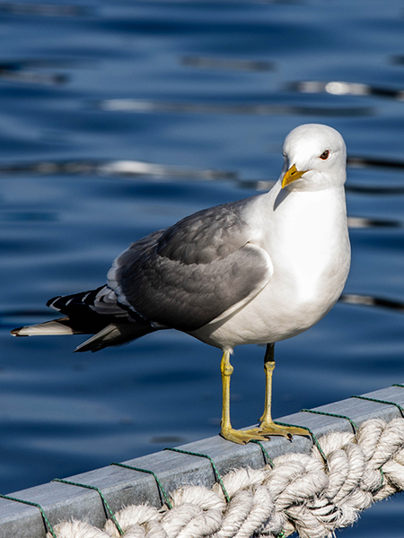
Delete the current page elements in the .page-contents container and add your own. The picture below serves as an anchor link if you select Images - Seagull from the menu.
Delete the current page elements in the .page-contents container and add your own. The picture below serves as an anchor link if you select Images - Seagull from the menu.
The image is a demo for the anchor Images - Seagull in the menu

Dropdown Menu
This menu is well suited for 'one-pagers', but can equally well be used for websites wilth several pages. The menu consists of some button-link and dropdown elements. How to make the dropdown element is explained on the page Dropdown Button.
The menu has been positioned fixed to stay at the top, visible at all times. The container .page-contents is where you put your own page contents. It has been populated with some content elements to show the use and placement of an 'in-page' anchor. You can tweak it the way you like it, but it is not advisable to touch the top padding. It is there to prevent items ending up behind the menu bar.
The navbar you see displayed on this page has been limited in width. The downloadable file has no such limits. However, if you wish, you can add a max-width to the outer element, the .dropdown-allinside.
Please note that the fixed positioning does not work exactly as it should on this page. That is because of the 'portal wrapping' that the component has been put into. You need to view the downloadable component to see the proper performance.
Download this component