The demo here is just a poster. That is because some class names have been used here, that also have been used in other components with different styling rules. You need to download the navbar to see how it works.
The classes .topnav (in narrow view) and .dropdown-content (in wide view) both have their height set to zero, and to be able to edit the menu links, you have to give them some height, 440 and 150 px respectively, so that you can see the content.
Just remember to set the height back to zero again afterwards, otherwise the 'magic' in the opening and closing them will not work.
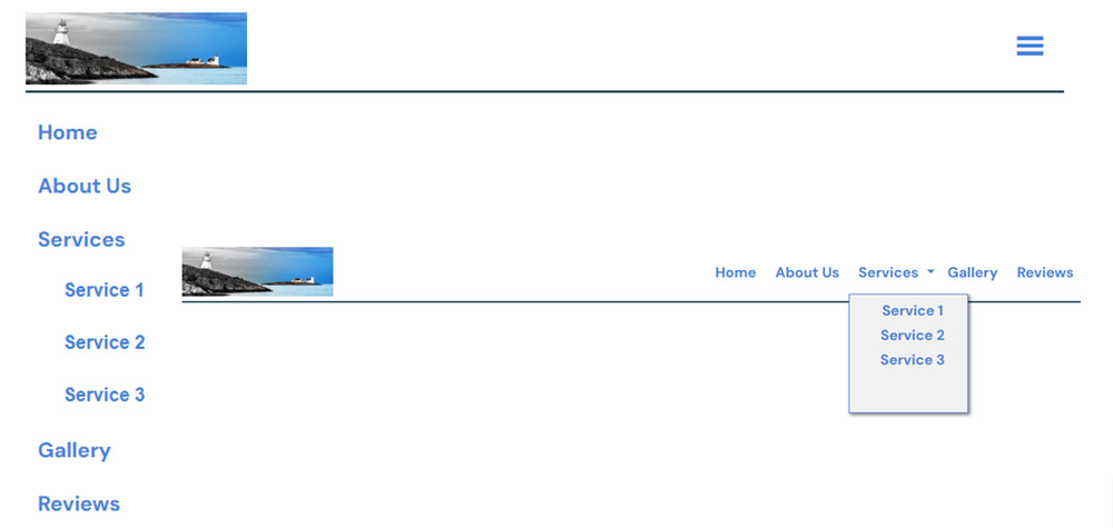
Responsive Dropdown Navbar
The demo here is just a poster. That is because some class names have been used here, that also have been used in other components with different styling rules. You need to download the navbar to see how it works.
The classes .topnav (in narrow view) and .dropdown-content (in wide view) both have their height set to zero, and to be able to edit the menu links, you have to give them some height, 440 and 150 px respectively, so that you can see the content.
Just remember to set the height back to zero again afterwards, otherwise the 'magic' in the opening and closing them will not work.
Download this component