Arendal at night, view of 'The sunny side' of the Pollen bay.
Optimal Image Sizes
Large, 'wall-to-wall' images seem to be quite popular in website building. But a large, maybe over 2000px wide image can be quite a heavy load on a small phone internet connection, therefore the best practice is to have the same image in various sizes, and let the screen size decide, which one to load. This is called a 'source set'.
The image on this page is such a source set. It contains four sizes of the same image, which have been prepared in Photoshop for the different breakpoints. When working in a framework with default br.pts. it's a good idea to use those given br.pts. for the sizing. Normally three different sizes will be enough, but because Bootstrap has 4 br.pts. we opted for the same number of image sizes..
You need an image editing programme, and you are not limited to just Photoshop.
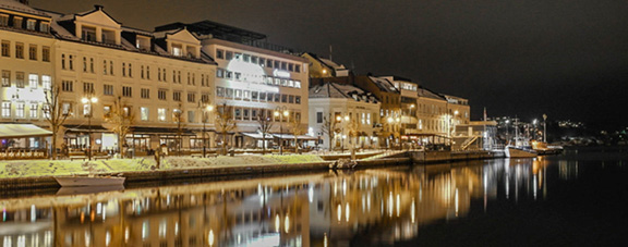
Download this component