The gallery is based on a sturdy 'Fallback-first' before switching to CSS grid at the 2nd breakpoint. The images have been positioned into a line-based grid system.
The challenge is really to find images in a size and shape that fit into the grid without losing their proportions. It needs a bit of practising. Start with a small grid and few images, then you can expand. The grid can have 12 x 12 cells as the maximum, this component used 6 x 5.
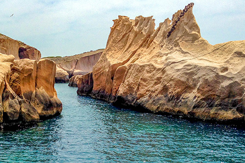

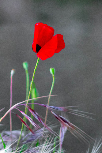


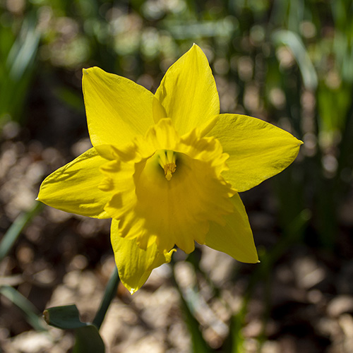
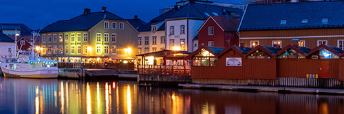
A small Image Gallery
The gallery is based on a sturdy 'Fallback-first' before switching to CSS grid at the 2nd breakpoint. The images have been positioned into a line-based grid system.
The challenge is really to find images in a size and shape that fit into the grid without losing their proportions. It needs a bit of practising. Start with a small grid and few images, then you can expand. The grid can have 12 x 12 cells as the maximum, this component used 6 x 5.
Download the Grid Gallery component