This is a simple modal gallery. The images get displayed in larger, one after the other, in one and the same modal 'frame'. The images' title tag is used to show the title below the images.
The size of the thumbnail images are set on each image, and the display in the modal has a size limitation in line 31 of the Javascript.
It is possible to have images of different size and shape, but it will look better if they all are the same. If you do want to use images of mixed sizes, you can add a second class name to them, calling them e.g. square-img, portrait-img etc. Portrait-orientated images may need to have the height limited.
You can add or subtract images without having to change anything in the settings. When adding images, just give them the same attribute that the others have, and a title.
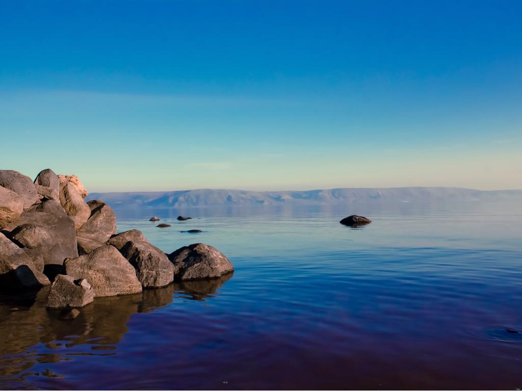
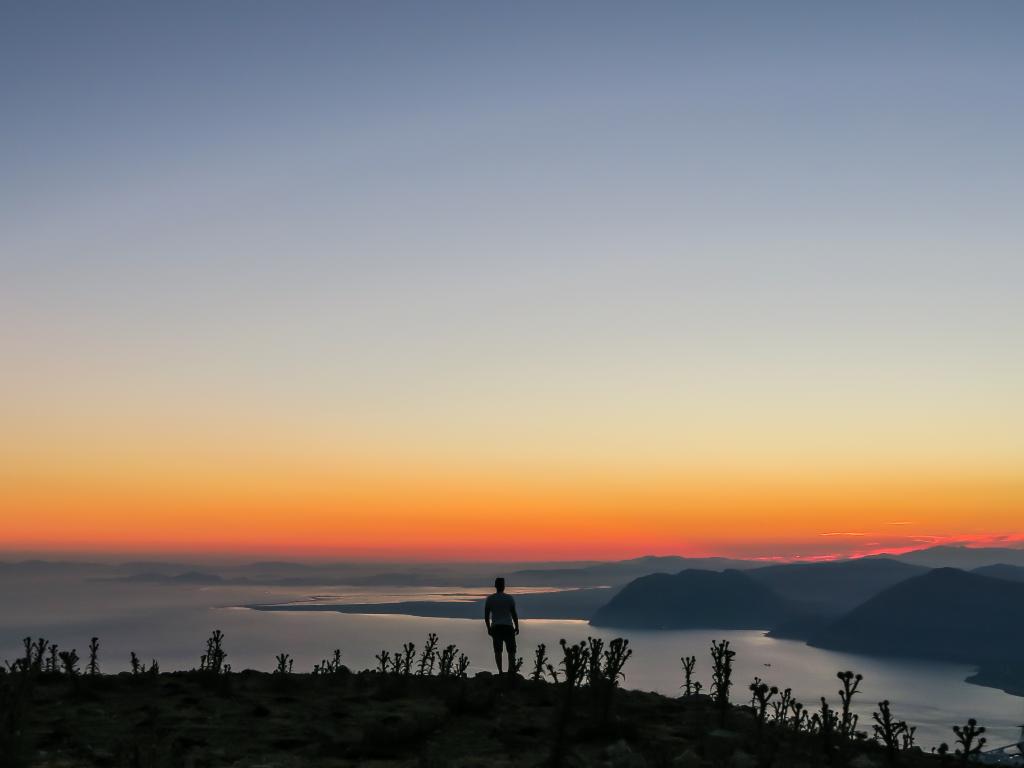
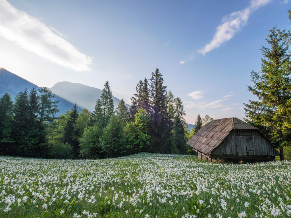
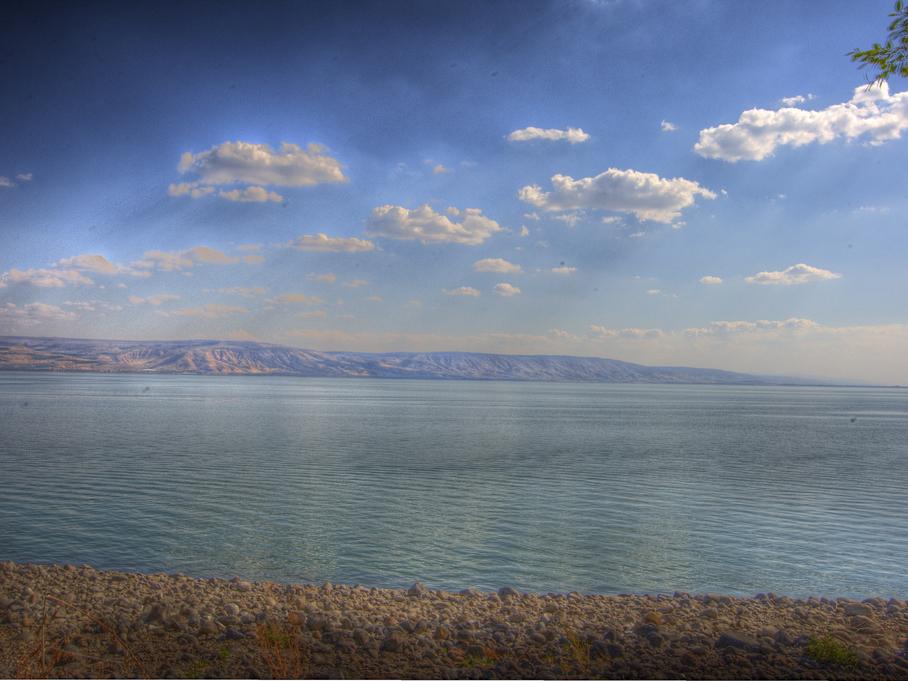
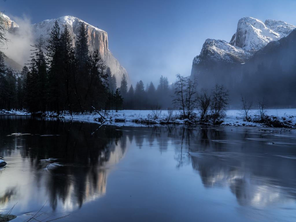
The images used in this component have been downloaded from Pixabay.
Download this component
This component can be used both for 'mobile-up' and 'desktop-down'.


Modal Gallery
This is a simple modal gallery. The images get displayed in larger, one after the other, in one and the same modal 'frame'. The images' title tag is used to show the title below the images.
The size of the thumbnail images are set on each image, and the display in the modal has a size limitation in line 31 of the Javascript.
It is possible to have images of different size and shape, but it will look better if they all are the same. If you do want to use images of mixed sizes, you can add a second class name to them, calling them e.g. square-img, portrait-img etc. Portrait-orientated images may need to have the height limited.
You can add or subtract images without having to change anything in the settings. When adding images, just give them the same attribute that the others have, and a title.
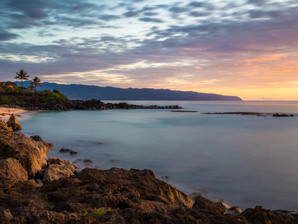
The images used in this component have been downloaded from Pixabay.
Download this component
This component can be used both for 'mobile-up' and 'desktop-down'.