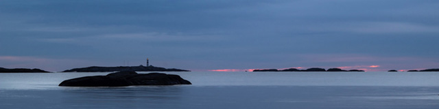
Early dawn at Skagerrak, near Arendal in Southern Norway.
Optimal Image Sizes
Large, 'wall-to-wall' images seem to be quite popular in website building. But a large, maybe over 2000px wide image can be quite a heavy load on a small phone internet connection, therefore the best practice is to have the same image in various sizes, and let the screen size decide, which one to load. This is called a 'source set'.
The image on this page is such a source set. It contains three sizes of the same image, which have been prepared in Photoshop for breakpoints at 640px and 1024px. You may name the images like e.g. 'dawn.jpg', 'dawn-1024.jpg' and 'dawn-640.jpg'. If you are working in a framework with default breakpoints, it's a good idea to use those given br.pts for the sizing.
If you are working mobile-up, you start with the smallest image and then change at each breakpoint on your way up. For desktop-down you start with the largest image. Normally three different sizes are enough.
You need an image editing programme, and you are not limited to just Photoshop.
Download this component for 'mobile-up'.
Download this component for 'desktop-down'.