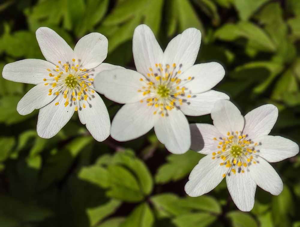
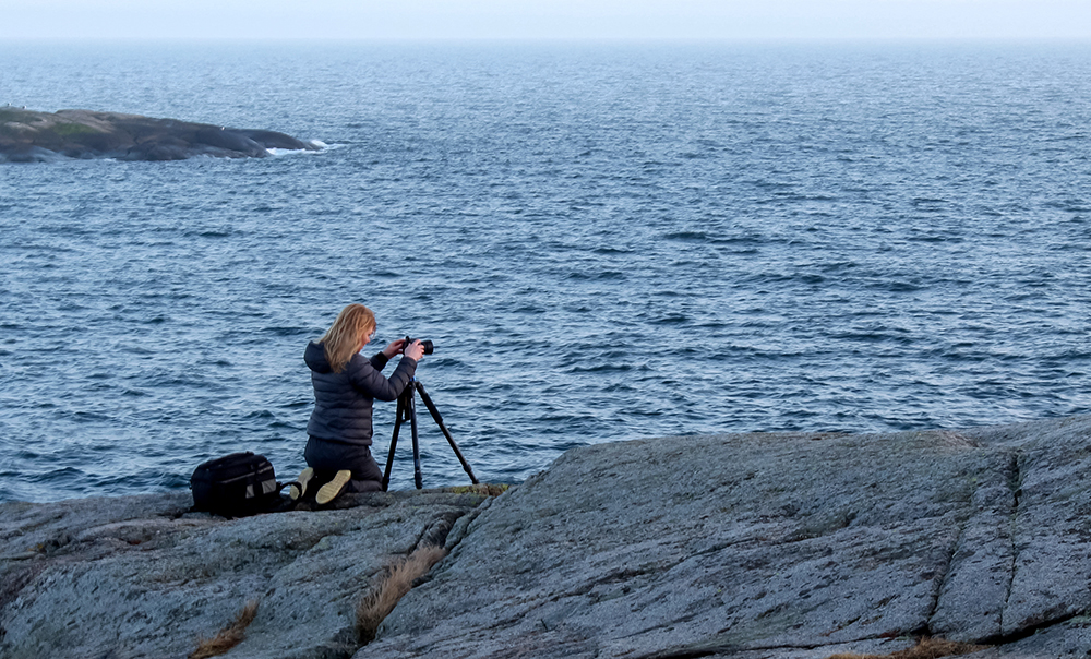
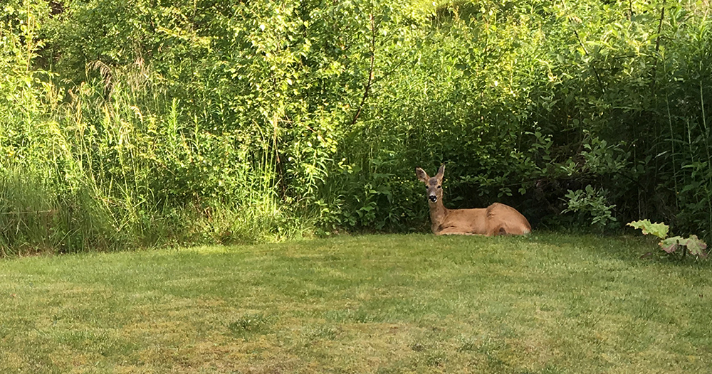
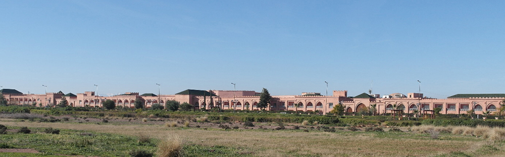
This is a very easy gallery to create. With flex positioning there is actually no need for break points at all. It consists of a wrapping container with four containers inside, which make up the columns. Then the images are put in, and the columns take care of the width.
It is a good idea to move the images around a bit so that the column height gets more or less the same. That is the somewhat fiddly bit.


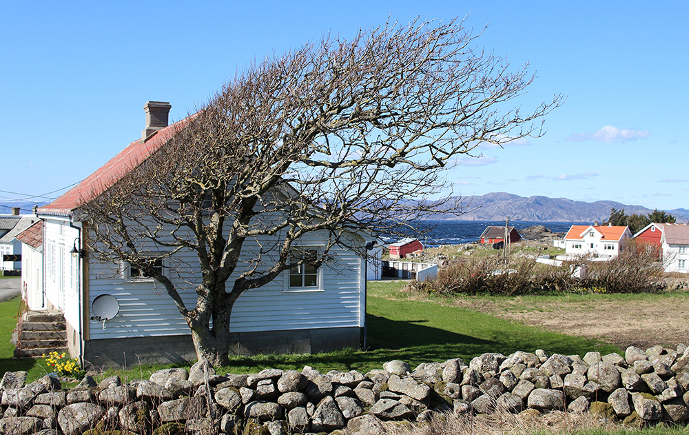
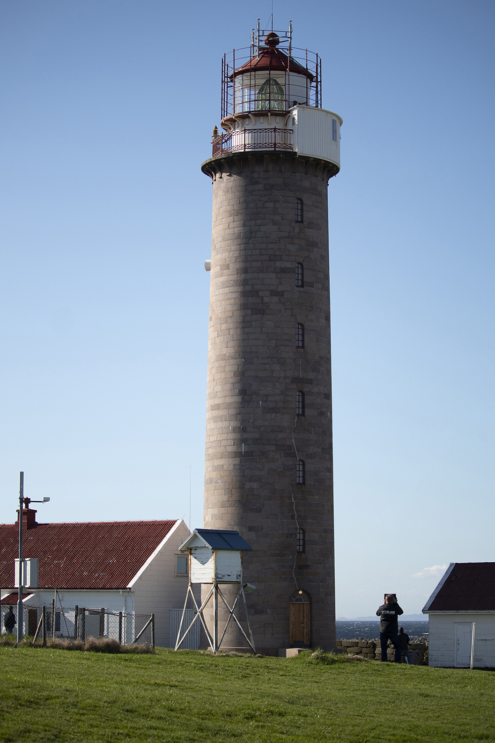
Flex Image Gallery
This is a very easy gallery to create. With flex positioning there is actually no need for break points at all. It consists of a wrapping container with four containers inside, which make up the columns. Then the images are put in, and the columns take care of the width.
It is a good idea to move the images around a bit so that the column height gets more or less the same. That is the somewhat fiddly bit.
Download this component for 'mobile-up'
Download this component for 'desktop-down'