

Close
Title
Back
Next
Latest items added:
Random Number Picker Simple PDF Form Hoverable Sidebar BtnsFull Component List:
Accordion Alert / Callout Animated Rules Another Lightbox Gallery Audio Player with Playlist Auto Sidebar Backbutton Basic Form Before/After Comparison Buttons Clickable Dropdown Collapsible Alert Contact Form Count-down Script Crossfade Slider CSS Parallax Cut-out Text Decorative Background Details/Summary Classes Drilldown Menu Drop Capitals Dropdown Buttons Easy Mega Menu Easy Modal Gallery Equal Height Columns Filtered Portfolio Flip-cards Glossary Table Hamburger Menu Hoverable Sidebar Btns HTML Quiz Horizontal Tabs Flex Image Gallery Image Modal Image Shapes Image Slider with Fade Jquery Parallax Lazy Loading Lightbox Gallery Magnifying Glass Masonry Grid Gallery Mega Menu Modal Optimal Image Sizes Oval Image PHP Includes Random Number Picker Range Slider Read More Button Responsive Card Table Responsive Navbar Responsive Shrinknav Responsive Sidebar Responsive Table Round Image Scroll to Top Searchbox Simple Audio Simple Cards Simple PDF Form Simple Shapes Simple Slider Skill Bars Slide-in Nav Spinning Text Sticky Mega Menu Sticky Navbar Sticky Vertical Menu Subnav in Dropdowns Tabbed Gallery Tab Navigation Text on Image Translucent Image Translucent Text Layer Vertical Tabs Video Video Scroller Wrapping Text Years Completed Zebra Striped Table


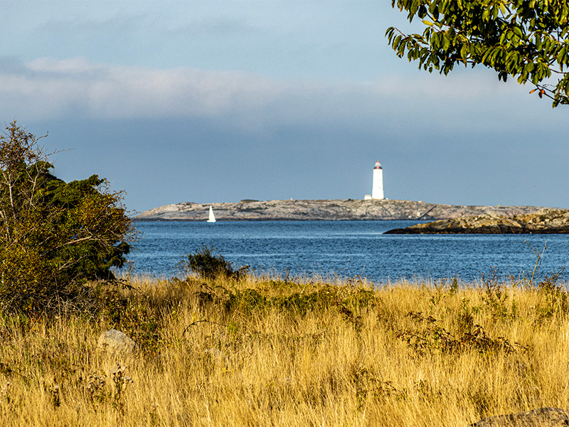
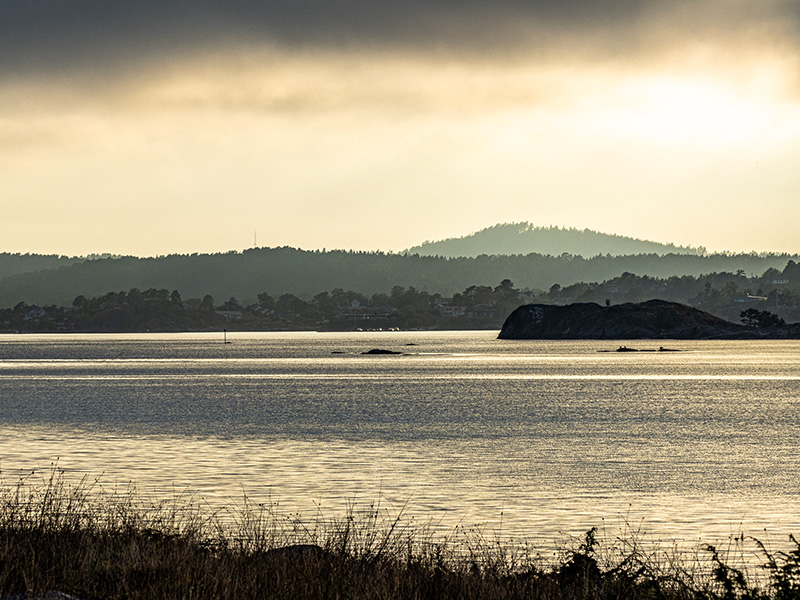
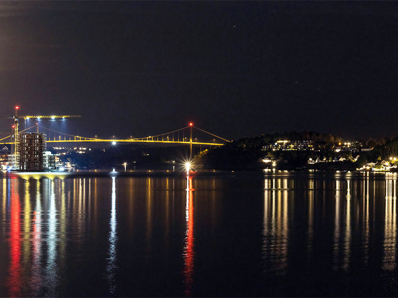
The size of the thumbnail images are set on each image, and the display in the modal has a size limitation of currently 800px width.
It is possible to have images of different size and shape, but it will look better if they all are the same. If you do want to use images of mixed sizes, you can add a second class name to them, calling them e.g. square-img, portrait-img etc. Portrait-orientated images may need to have the height limited.
You can add or subtract images without having to change anything in the settings. When adding images, just give them the same attribute that the others have, and a title.
Download the component.