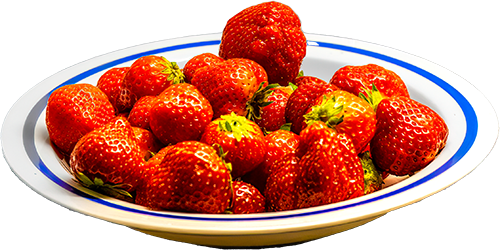
Want more strawberries? Click on it!
Latest items added:
Random Number Picker Simple PDF Form Hoverable Sidebar BtnsFull Component List:
Accordion Alert / Callout Animated Rules Another Lightbox Gallery Audio Player with Playlist Auto Sidebar Backbutton Basic Form Before/After Comparison Buttons Clickable Dropdown Collapsible Alert Contact Form Count-down Script Crossfade Slider CSS Parallax Cut-out Text Decorative Background Details/Summary Classes Drilldown Menu Drop Capitals Dropdown Buttons Easy Mega Menu Easy Modal Gallery Equal Height Columns Filtered Portfolio Flip-cards Glossary Table Hamburger Menu Hoverable Sidebar Btns HTML Quiz Horizontal Tabs Flex Image Gallery Image Modal Image Shapes Image Slider with Fade Jquery Parallax Lazy Loading Lightbox Gallery Magnifying Glass Masonry Grid Gallery Mega Menu Modal Optimal Image Sizes Oval Image PHP Includes Random Number Picker Range Slider Read More Button Responsive Card Table Responsive Navbar Responsive Shrinknav Responsive Sidebar Responsive Table Round Image Scroll to Top Searchbox Simple Audio Simple Cards Simple PDF Form Simple Shapes Simple Slider Skill Bars Slide-in Nav Spinning Text Sticky Mega Menu Sticky Navbar Sticky Vertical Menu Subnav in Dropdowns Tabbed Gallery Tab Navigation Text on Image Translucent Image Translucent Text Layer Vertical Tabs Video Video Scroller Wrapping Text Years Completed Zebra Striped TableWant more strawberries? Click on it!
 ×
×
Help yourself! These were the first ones of the year.
Some text and a picture in the Modal. You can change that and add your own content instead.
A modal is also sometimes called a 'reveal' because it can display something that is not visible until a button has been clicked on. You can put almost anything into the modal, and the size can be changed to fit the contents.
Some of the file names and ID names are used by a small java script, so if you change something, it would be best to check with the script and use the same names there.
Download the component.